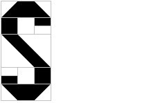
From My Pieced Alphabet:
Connaught (See also 4 January 2010)
What if I make my Patchwork alphabet but instead of a variety of colors I just use two - one for the letter and one for the background?
This makes choosing colors simpler.
The first thing I notice is that there are unnecessary seams that can be eliminated.
Doing away with the unnecessary seams means less sewing.
But it also means the sewing is easier. All the fussy matching of seams on the center diagonal is gone.
That diagonal has always bothered me because it is narrower than the rest of the letter. The Patchwork alphabet is based on a 1" x 1" grid and the narrowness is unavoidable and acceptable. But I am no longer tied to the Patchwork grid. So I can change it.
Now the S has a more uniform line weight and I like it better.
Several other letters need similar adaptations. The result is that the Connaught alphabet truly becomes an alphabet on its own, separate and distinct from the Patchwork alphabet.


No comments:
Post a Comment