▼
Monday, December 6, 2010
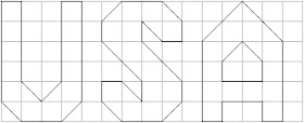
I found the first USA in a quilt magazine some years ago. It was part of a patriotic quilt.
It is inconsistent. The U is bottom heavy. The S is Fat. The A is top heavy and feels short. All three letters could be from different alphabets.
I think these letters were designed on a grid and that the designer was afraid to go off the grid.
I decided to try redesigning these letters using the same grid.
I started with the simplest letter, the U, and made the verticals slightly wider.
It is no longer bottom heavy. When it comes to sewing, the old U and the new U can be sewn the same way. One is not easier to piece than the other. One just looks better.
To make the A I turned the U upside down and added a crossbar.
It's no longer top heavy and it's no longer short. Originally the A and U shared almost no design elements. Now they do. Now they look like they are from the same alphabet.
I began redesigning the S by placing the bottom of the U at the top and bottom of the grid.
Given the thickness of the letter stroke, it isn't possible to join the top and bottom using a diagonal. So I used a horizontal join instead.
The vertical bits at the ends of the S are a bit fussy. The other 2 letters don't have fussy details.
When I remove the fussy bits the ends of the new S are like those of the original.
This reads well without the fussy bits and it's simpler to sew.
THE MORAL: An alphabet needs to be consistent to look good. Consistency is not a matter of conforming to a grid. A grid is just a tool to help you design. Consistency comes from using common design elements.
There are a lot of different possible pieced alphabets; to see some of mine go to My Posts by Subject in the sidebar on the right and click on Lettering.


No comments:
Post a Comment